
Preparing Images For Print
You’ve put so much time and effort into it – traveling to distant locations, going out early and late in the day, and finally capturing those perfect conditions! Returning home, you spent hours post-processing your favorite images and now you have a final product you are proud of. What’s the next step? It seems so anti-climatic to simply share the image on social media. Your best photos deserve to be printed and hung on the wall! As a workshop instructor, I get asked a lot about preparing images for print and what kind of workflow I would recommend. In this article, I will answer those questions and more.
Preparatory Work
First, you need to be using a good quality monitor. I recommend a monitor with IPS (in-plane switching) technology since it will have less problems with color and contrast shifts due to viewing angle. Next, you need a calibrator to adjust the color tones to a known standard and dial in your monitor brightness (most monitors are too bright). If you and your print lab both use a calibrated workflow, the color you see on your screen will match what you see in the print. Obviously, there will be subtle differences due to how colors are rendered on a backlit screen vs reflecting off the ink in a print, but it should be very close. I personally use the I1 Display Pro calibrator. I find that it’s easy to use and does a great job with a wide variety of different monitors.
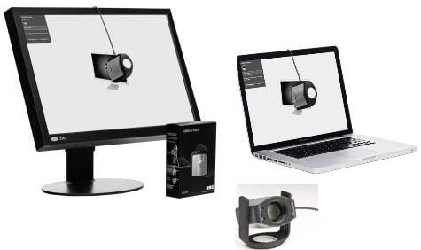
XRite i1 Display Pro Monitor Calibrator
Second, you need to clean up your image. Open the file in Photoshop and zoom in to 100% pixel view. Hold down the spacebar and click-drag through the entire image looking for sensor spots and artifacts you may have not noticed before. If you are doing a large print, these things become very visible! You would hate to spend big $$ on a print only to realize that forgot to clean up some spots or artifacts. I do not recommend using Lightroom to clean up spots and artifacts. The tools in Photoshop like the Spot Healing Brush, Content Aware Fill, and Patch Tool do a much better job.
Third, you will want to crop your image to the aspect ratio you will be printing it at. You may wish to create a virtual copy in Lightroom if you are cropping significantly. That way you can always come back to the original aspect ratio in the future.
Fourth, you need to realize that a backlit image on your screen will always look brighter than the same image in print. I usually will brighten an image for print anywhere from a third of a stop up to a full stop using the Exposure Slider, depending on how dark the image is to begin with. Watch carefully that you don’t push your highlights or whites too far and you may need to reduce highlights at the same time. Having your monitor set at the correct brightness with well-controlled ambient lighting will help a lot in this regard.
Sizing and Resolution
For the best detail, photo prints should be done at 300 pixels per inch. This simply means that for each inch of a print, you need at least 300 pixels of digital resolution. For example, my Sony A7rIII is a 42.2MP camera. The images at native resolution are 7952 x 5304 pixels. If I take each of those numbers and divide by 300, then I get a native print size of 26.5 x 17.7 inches. Any print smaller than those dimensions will not need enlargement. Prints larger than those dimensions will require upsizing.
Photoshop is the best tool for upsizing, especially with the new Preserve Details 2.0 algorithm. To do this, open Photoshop, go to the Image Menu, and select Image Size. Set the Width and Height to Inches and deselect the Resample box. You’ll notice that the Width/Height/Resolution are all locked. Changing one value will necessarily change the others. This is because the resolution is fixed without resampling. Next, set the resolution to 300 pixels/inch and you will see what your native print size is.
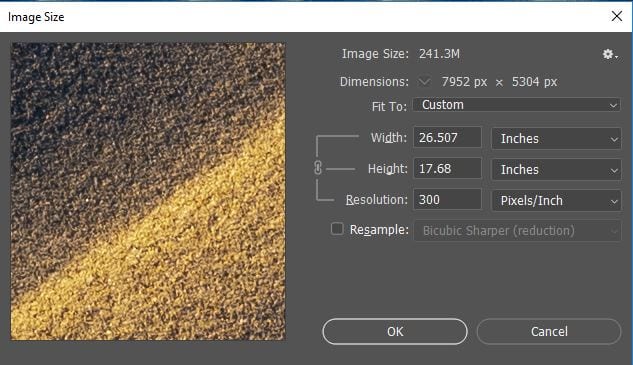
Photoshop Image Size – Set to Inches, Deselect Resample, and Set Resolution to 300 pixels/inch.
To upsize the file, click on Resample and choose Preserve Details 2.0. Next, put a number in the Width or Height boxes for the maximum size of the print. For example, if I’m going to do a 60×40″ print, I will put 60 in the Width for a horizontal image. As long as I have previously cropped the image to the right aspect ratio (in this case 3:2), then the other dimension will automatically be correct. Photoshop can also reduce noise – I usually leave this around 4%. Click Ok and let Photoshop work its magic! If you are printing smaller than native resolution, you can use the Bicubic Sharper (reduction) algorithm in Image Size for a sharper print.
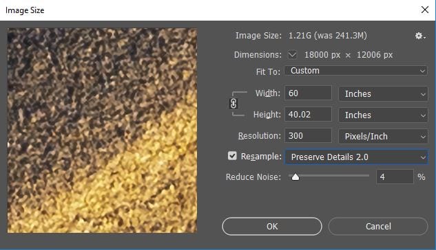
Image Size: Upsizing to a 60×40″ Print
Color Spaces
A Color space is simply a range of colors that can be displayed in an image. sRGB is the smallest color space that was designed back in 1996 for monitors, printers, and the internet. It continues to be the standard to this day. Adobe RGB is a larger gamut color space – about 35% larger than sRGB. Special monitors can display the full Adobe RGB spectrum and higher-end print labs can print in Adobe RGB. Pro-Photo RGB is the largest color space, but it can’t be displayed on monitors nor in print. It is mostly useful for editing your shots. I like to do my editing in the largest color space, i.e Pro-Photo RGB and then convert to a smaller colorspace at the end of my workflow. If an image is destined for the web, it goes to sRGB. If I’m sending it to my print lab, I convert it to Adobe RGB.
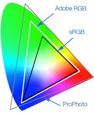
Color Space Comparison: sRGB, Adobe RGB, Pro-Photo RGB.
Note how Pro-Photo RGB contains colors that our eyes can’t even see!
The important thing is to keep your color spaces consistent. Find out what color space(s) your print lab will accept. If they only do sRGB, then you shouldn’t be sending them images in Adobe RGB. If you did, the colors will be very dull and washed out. Higher end print labs will print in Adobe RGB and if you use this expanded color space, your prints will be much more rich and vibrant than if you just used sRGB. You can convert to different color spaces in both Photoshop and Lightroom.
Image Formats
JPG images are the standard for the web since they are compressed and have a much smaller file size. TIFF images can be saved as uncompressed or with lossless compression. A TIFF image will be much larger but will contain much more detail and data compared to a JPG file. For smaller prints, JPG images will work just fine. But for larger prints, and especially for enlargements, I prefer using a TIFF format. You will need to consult with your print lab to find out if they will accept TIFF files. Many will only accept JPG’s due to file size limitations. If your lab only accepts JPG’s, make sure you save the JPG with the highest quality setting (i.e. least amount of compression).
JPG files are always 8-bit in nature, meaning that each bit of information can contain a maximum of 256 different levels of color and tone. A 16-bit image on the other hand, can contain a maximum of 65,536 levels of color and tone. That is a huge difference! This means that a 16-bit image will have much smoother gradations of color and tonality compared to an 8-bit image. For lightly processed images, you will probably not see any difference in print. However, for images that have been edited more heavily, the 16-bit TIFF will provide a more pleasing final print. Again, you’ll have to consult with your print lab if they will accept 16-bit TIFF images or not. Since they are so large, I usually have to Dropbox or Hightail the files to my print lab.
Print Mediums
Back in the day, I used to do a lot of paper prints. But they were a LOT of work. When they would come back from the lab, I would have to get the print mounted, cut matting to surround the print, put it all in a frame, and then seal up the back of the frame. Canvas prints were much easier since they would come ready to hang in a gallery wrapped display. Canvas is a very forgiving medium, meaning you can really upsize a lot before you see any artifacts! But canvas prints aren’t as trendy as they used to be. Now, I primarily do metal prints. This is for several reasons:
- Metal prints have a clean, crisp presentation with excellent colors and details.
- Prints come ready to hang with a contemporary float mount. They can also be framed in classy-looking floater frames.
- Prints can be done on either Gloss Metal (bolder, more saturated colors) or Matte Metal (fewer reflections).
- Chromaluxe Metal is scratch resistant, can be cleaned with chemicals, and has a lifetime guarantee against fading.
If you are using a print lab for metal prints, make sure they are using real Chromaluxe Metal. Many labs will user a cheaper substitute and you really get what you pay for. There many other types of prints out there, many of which can cost you a lot of money. But when I’ve compared metal prints to things like acrylic and paper, I find that like the look of metal the best. But everyone has a different opinion, so it’s best that you try a few different things to find what you like.
Sharpening for Print
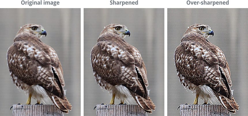
Under and Over Sharpening Comparison: Note the excess grain, halos, and grungy detail in the over-sharpened version. Make sure you avoid this at all costs!
Output sharpening can be a very technical and demanding concept. But I want to keep things simple. Yes, you need to sharpen for print because the ink will cause slight blurring during the printing or sublimation processes. How much do you sharpen for print? Well, that can be a subjective thing. If I am using Lightroom to output the file for print, I will use the built-in Sharpening Presets. If it’s going on Gloss Metal, I use the Glossy Paper preset. If it’s an image like a night shot or something with lots of grain, I will use Low or Standard for the Amount. Otherwise, I will use High for the amount and then open the file later in Photoshop to make sure it doesn’t look over-sharpened. The amount you use here will depend on how much you have sharpened the image before export. If you have already applied a good amount of sharpening, then you would want to use Low, Standard, or even None. Here is an example of a Lightroom Export:
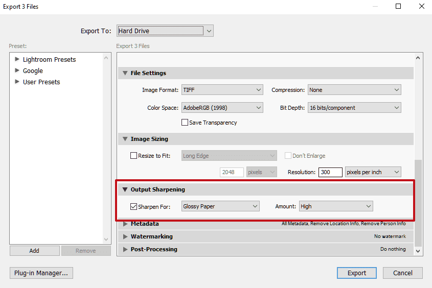
Lightroom Output Sharpening Dialog for High Quality Print
Adobe RGB, 16-Bit TIFF, High Output Sharpening
If you are in Photoshop and want to apply Output Sharpening, I like to use the High-Pass Filter Method. To do this, copy the image to a new layer (Ctrl or Cmd J). Click on the new layer, go to the Filter Menu, and choose Other -> High Pass. Select a radius in the 1.8 to 2.8 pixel range depending on how aggressive you want the sharpening to be. Click Ok. When it finishes, you will see a grayscale image with very faint edges. This is expected. Next, change the Blend Mode of the Layer to Overlay. Zoom in to 100% pixel view and dial back the opacity of the layer until the sharpening looks to be at the proper level. You may wish to mask out any flat tonal areas like the sky from the sharpening if you’re worried about adding grain. Make sure you sharpen the image after any resampling has been done (upsizing or downsizing). As a final tip, you can view the file in Photoshop at the desired print size and resolution by going to View -> Print Size.
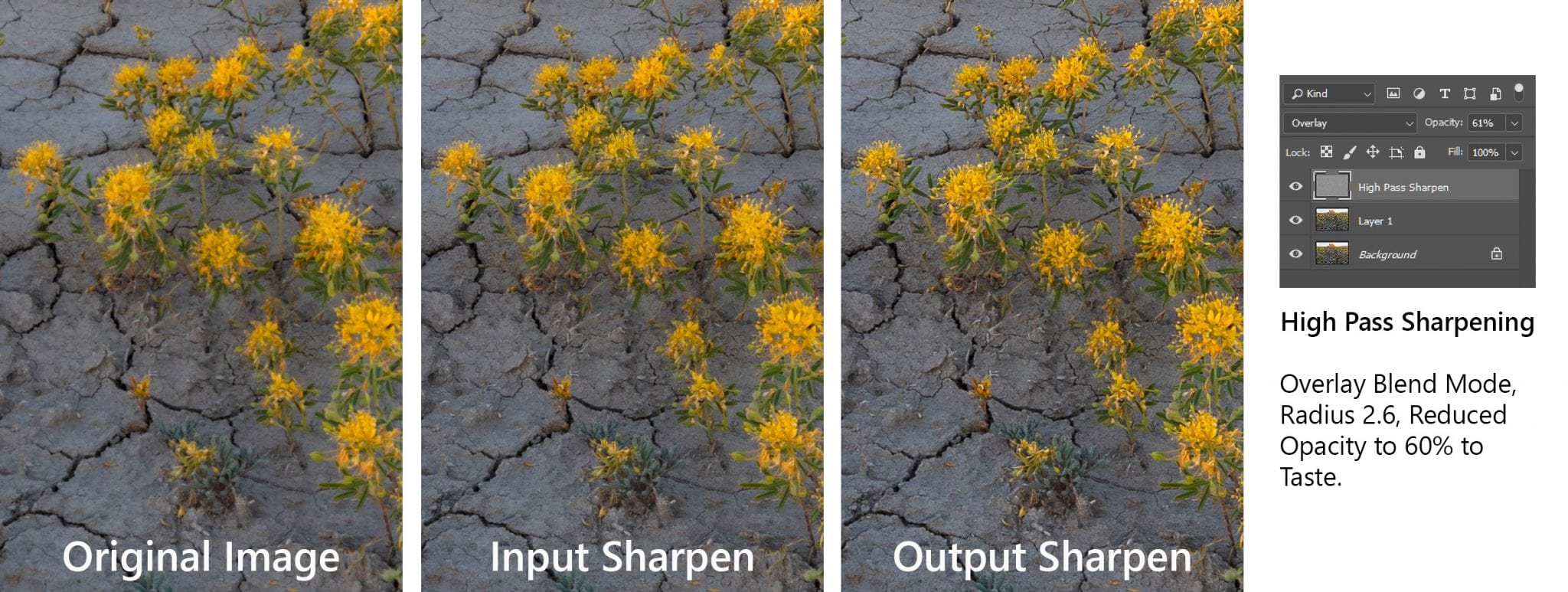
Original, Input, and Output Sharpening Comparison Using High Pass Filter in Photoshop
Putting It All Together
- Use a Calibrated Monitor
- Clean Up the Image, Crop to the Desired Aspect Ratio, and Brighten for Print
- Perform any Necessary Upsizing or Downsizing in Photoshop or Lightroom
- Perform Output Sharpening and Save the File in Your Desired Color Space and Format.
- Send the File to Your Print Lab.